
Nate Berkus is a very well-known interior designer in the world. He’s become known for curating spaces that feel elevated yet accessible, and he does so with a polished style that’s also quite endearing. Although Berkus has a history of delivering many iconic designs, there are a couple of decisions that are making design experts scratch their heads.
In this article, we’ll go a little deeper into some of the decisions Nate Berkus makes in home design that some love and some cringe. These aren’t aesthetic; these are about practicality, these are about how these choices actually fit into real life. Alright, now let’s get into the designs that stir it up.
Furniture in Small Spaces
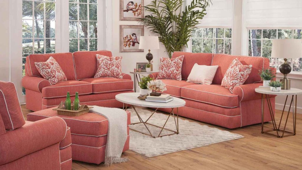
Couches and chairs that are too big are enticing, they say comfort and luxury. However, once you pack them into that small area, a small room, they can take over that space faster than you can say ‘feng shui.” Many designers will tell you that Berkus’s use of oversized furniture in small rooms is a habit that sacrifices balance and proportion.
Too Much Beige

Neutral tones are a hallmark of Nate Berkus’s designs. Beige is nice, but critics say relying on it makes spaces boring, even if it’s soothing and versatile. A room without contrast is flat and dare we say, a little dull. Berkus has a love affair with beige that often goes too far, but the best interiors marry neutral with pops of color or texture.
Over-Reliance on Trends

Berkus is certainly capable of keeping up, but sometimes his designs over-rely on passing trends. In just a few years, all those trends can make the spaces feel dated. Not all of Berkus’s designs hit that sweet spot that experts suggest is a good recipe for a timeless piece.
Open Shelving in Kitchens

Open shelving in the kitchen is probably stunning on Instagram, but for many homeowners, it’s a practical nightmare. The dishes are exposed and collect dust: an arrangement that requires upkeep that most people just are not capable of. Berkus has been an advocate of this trend on a few projects, and the critics will argue that the aesthetic payoff is not worth the hassle.
Overuse of Brass

Nothing is as chic as brass, but when used too much, it can easily overpower a space. Berkus has loved brass in everything from light fixtures to cabinet hardware; while it gives warmth and glamour, some designers say that too much brass can make something feel dated. Moderation is key, and a little goes a long way.
Layered Rugs
Layering rugs on top of one another to create a textured look is a Berkus favorite. This technique can be divisive, but it adds depth to a room. Layering rugs often complicates the visual flow and adds unnecessary tripping hazards, explains many designers. If you have kids or pets, layered rugs might not be for you.
Minimal Support Floating Shelves

Modern and sleek-looking, floating shelves do have their problems. Berkus’s use of these shelves in defiance of physics elicits a raised eyebrow or two from designers. If not supported properly, they can sag or even fall over time when overloaded with decor items or books.
Overly Styled Coffee Tables

Berkus’s coffee tables are always so styled impeccably that they can sometimes come across as less functional space, and more of a showroom display. Layers of books, candles, and trinkets are a great prop for photos, but they’ll get in the way of your coffee cups, remotes, and snacks.
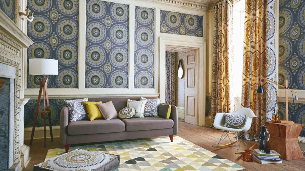
Gallery Walls Everywhere

Nate Berkus’ signature touch includes gallery walls, but let’s face it, they’re not for everyone. ‘Gallery walls can feel chaotic rather than curated, ‘ say some designers, who point out that too many gallery walls in a home can overwhelm. And, getting the arrangement right can be a difficult task that leads to frustration instead of inspiration.
Faux Plants
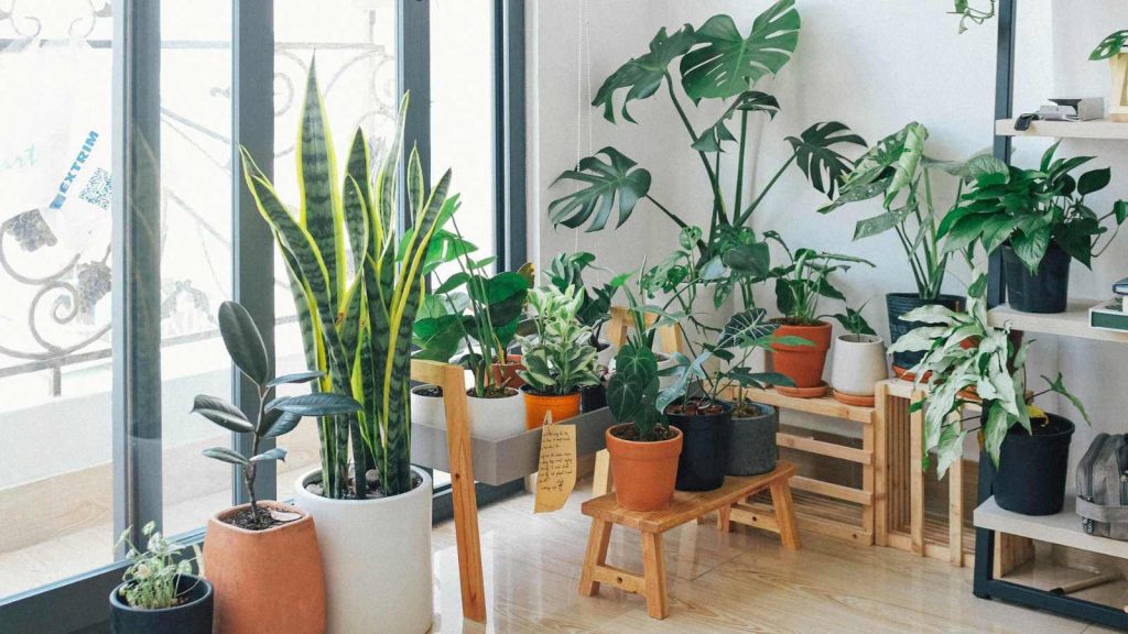
There’s a place for faux greenery, but Berkus’s detractors decry that he sometimes leans a little too heavily on fake plants. Although they’re easy to maintain, they may not have the same freshness and vibrancy as real greenery. A real plant, even if it’s small, brings life to a room in a way that no faux plant can. Also, real plants purify the air according to NASA.
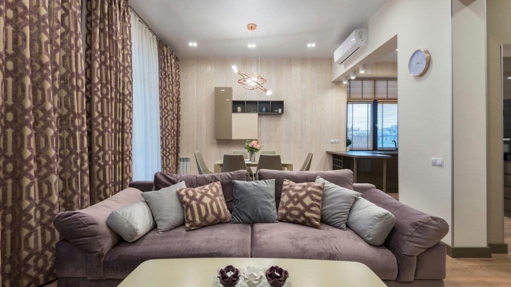
Bulky Drapes

Drapes can add some drama and elegance to a room, but they can also weigh a space down and make it feel dark. While critics of this choice feel that Berkus is too reliant on thick, ornate curtains, especially in spaces that could use more natural light, it can be an effective way to add a pop of color to a room.
Too Many Textures
Good design is all about mixing textures, but, as with most things, too much of a good thing can backfire. Nate Berkus likes to use a combination of fabrics, finishes, and materials throughout a space. Critics say this may cause a room to feel disjointed, rather than cohesive, but can also create visual interest.
Statement Walls That Dominate

Statement walls, whether it’s a bold wallpaper or a dramatic paint color, can give a room personality. But if the statement is too loud, it can own the space and contribute to making everything else secondary. Berkus’s bold choices in this area sometimes eclipse the rest of a room’s design, say designers.